Brand Color Forecast
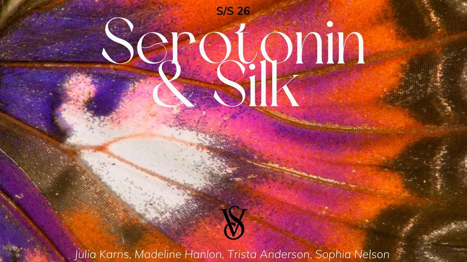
Serotonin & Silk S/S 26
The Ask
While attending the Santa Reparata International School of Art in Florence (2025), my four-person team was assigned a color forecasting project. We were instructed to get into groups of 4, select a clothing brand of our choice, and execute a color forecast for a future collection including a color scheme, mood, and one focus color.
Skills Used
Color Psychology.
Presenting.
Concept Boards.
Collaboration.
Brand Analysis.
Color Psychology. Presenting. Concept Boards. Collaboration. Brand Analysis.

The Process
-
My team and I started by getting to know each other and aligning on the project requirements. From there, we identified our individual strengths and built a structured plan to execute the color forecast effectively.
-
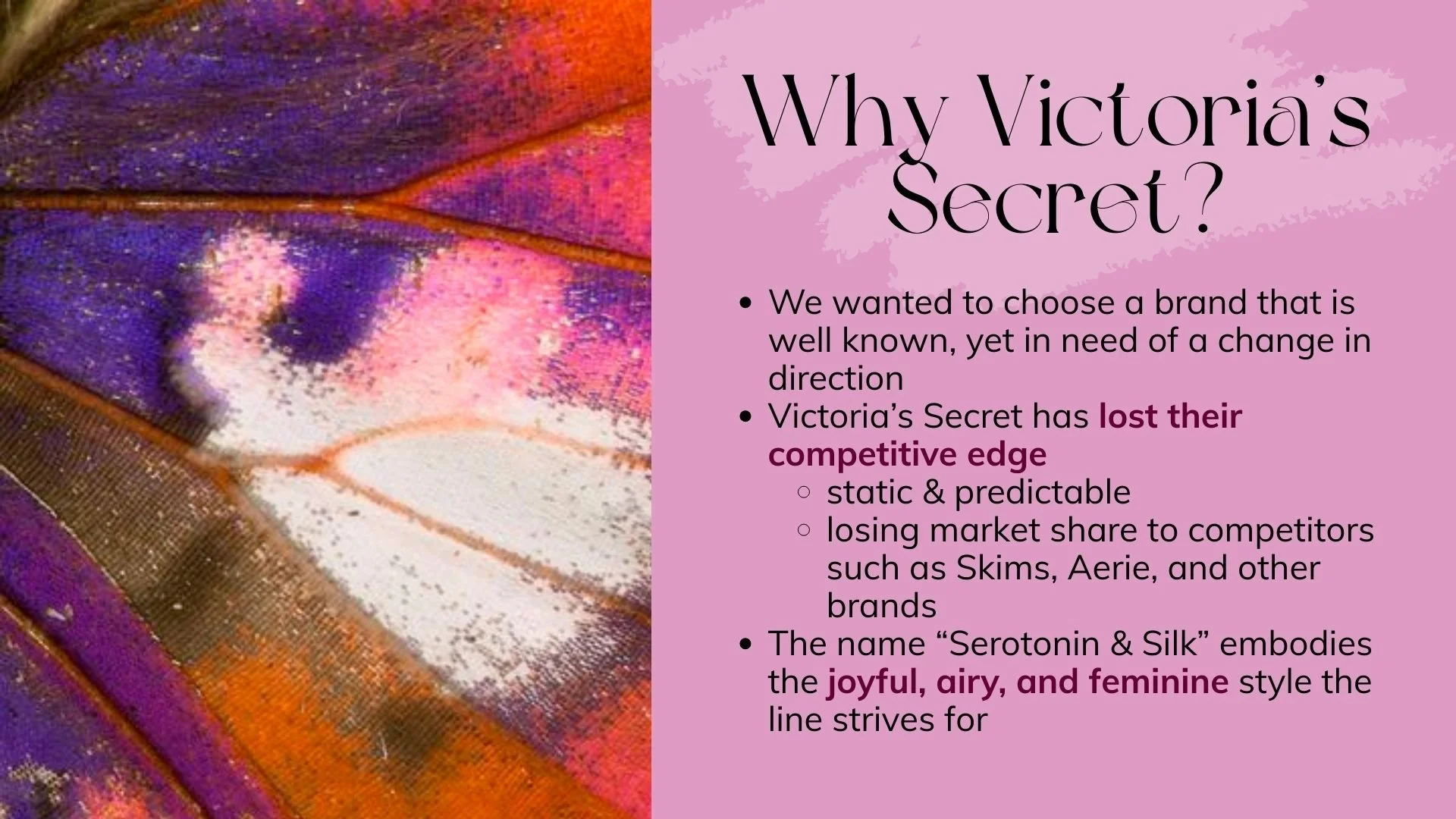
Our selection process began with a collaborative discussion aimed at finding a brand that felt both authentic to us as individuals, and relevant to today's market. After careful evaluation, we reached a consensus on Victoria’s Secret. Our decision was based on their room for growth and its differentiation as a lingerie brand within the broader women's apparel category.
-
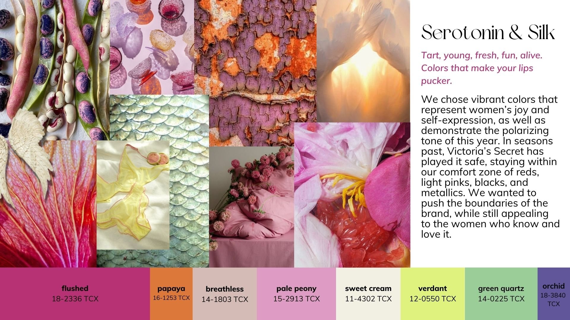
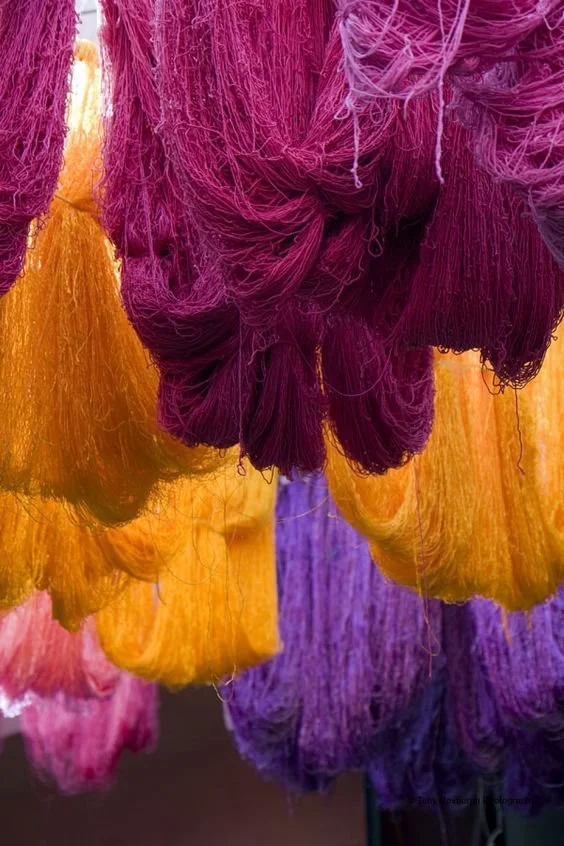
We started by brainstorming ways we felt Victoria Secret can reshape the direction of their branding when it comes to visual representation, and design choices. We knew we wanted to draw inspiration from the textural that can be found all around us that are reminiscent of an emerging spring season. In discussing these ideas, we were then able to collect an assortment of images we felt reflected the natural, feminine, and refreshing feelings we were striving to communicate.
-
In examining our assortment of imagery, we leaned into lively, natural feelings from a modern feminine lens. Capturing a balanced mix of rosy pinks, musky neutrals, and bold citruses left us with an arrangement of energetic hues.
-
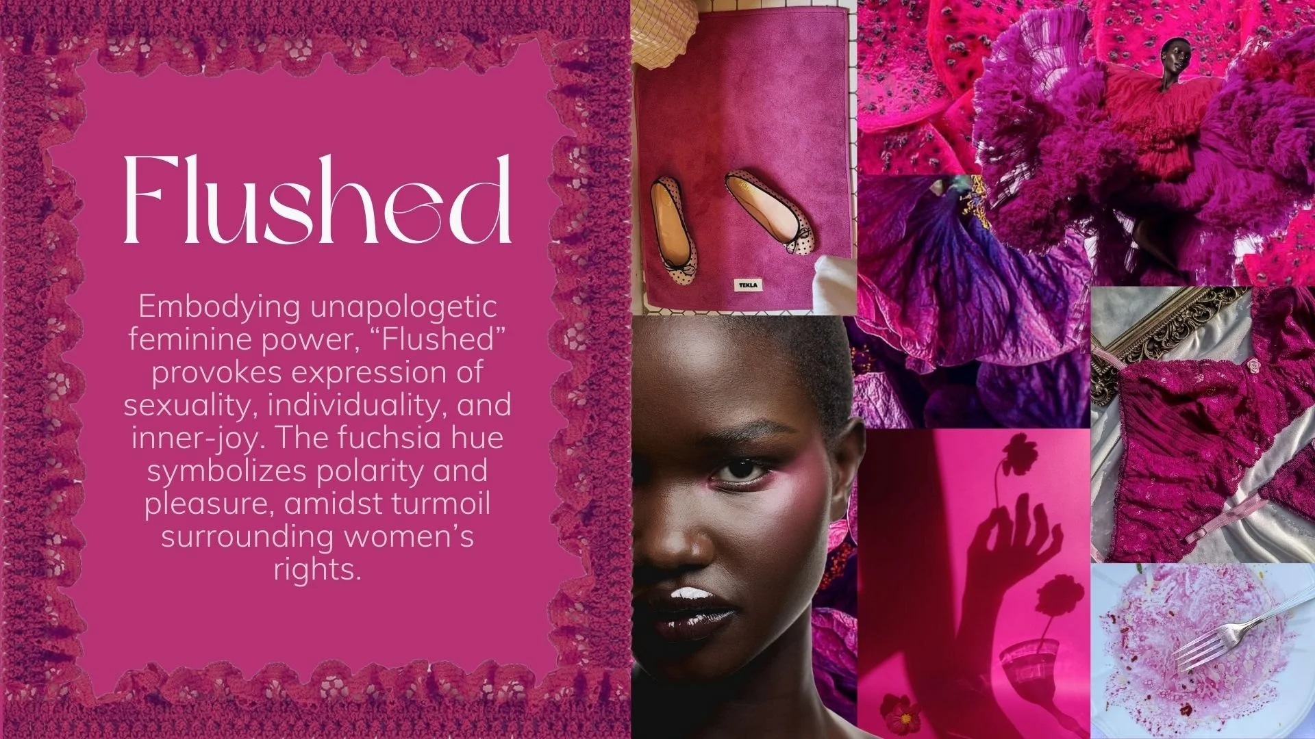
Solidifying our focus color for the project required our collective consideration of emotional associations tied to the shade, as well as external factors and symbolism. We landed on “flushed”, a subtly dark, but vibrant shade of fuschia.
The Outcome
I didn’t include this project for the sake of any major takeaways, or significant skills gained. I simply found a lot of joy and fun in helping bring the idea to life. I resonated heavily with the style and direction of the aesthetic themes, and it was refreshing to express themes of femininity with such focus. All in all, this was an especially meaningful academic project to me.